
I faced several restrictions and requirements when creating illustrations, and I found various approaches to solve these problems.
Below are some of them.
Since the functions in mobile banking have literally always been associated with the phone, it was necessary to try to bypass the images of cards, hands and phone as often as possible.

In some cases, I decided to replace real objects with simple shapes in order to avoid confusing the user with too many similar objects on the images.


One of the important aspects that I pay attention to demonstrate simplicity, friendliness, and locality.
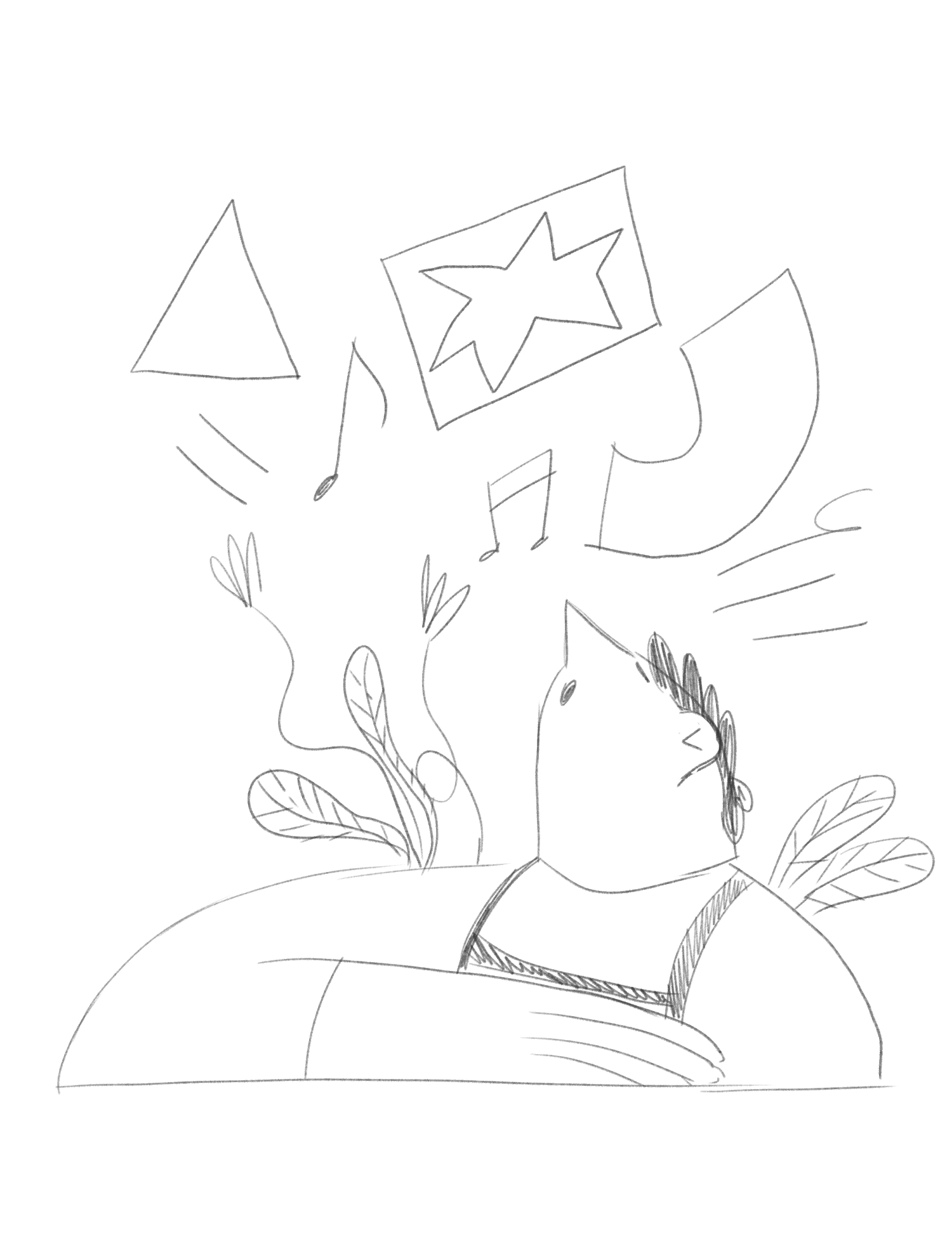
For example, on the welcome screen, which is the first thing a user sees when launching the app. These illustration were created to emphasize these characteristics and provide a pleasant first impression of the app.

These are the first three examples that did not match. And that's why.
1 - Loneliness. It is not clear what does the horn have to do here.
No emotions, no feeling of community.
2 - Loneliness. The character's face is not visible, which can cause a feeling of secrecy, deception.
3 - There is a community here, but lack of interaction with the viewer due to the fact that the faces do not look at us.
Speaking about nationality in illustrations.

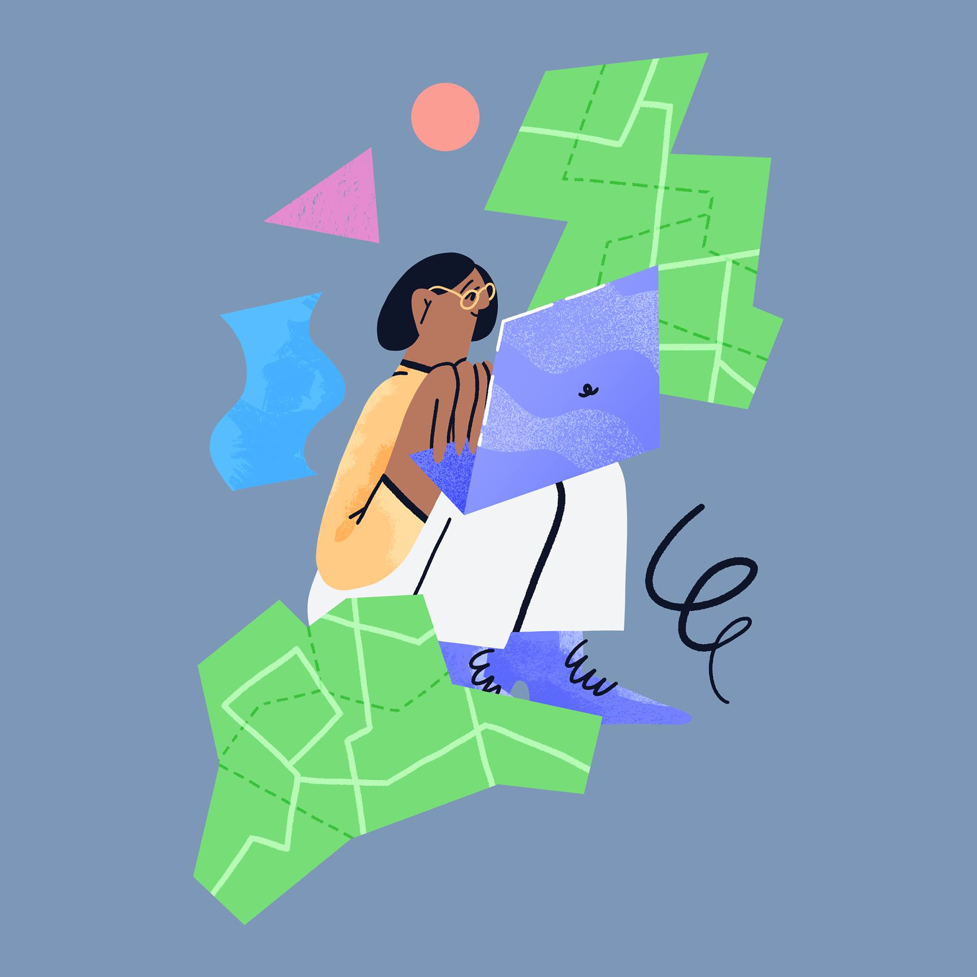
Since the name of the service already suggests a connection to location, I didn't want to overemphasize it in the illustrations. Therefore, I avoided using specific symbols related to location, except for cases where it was necessary to highlight a particular part of the service's history.
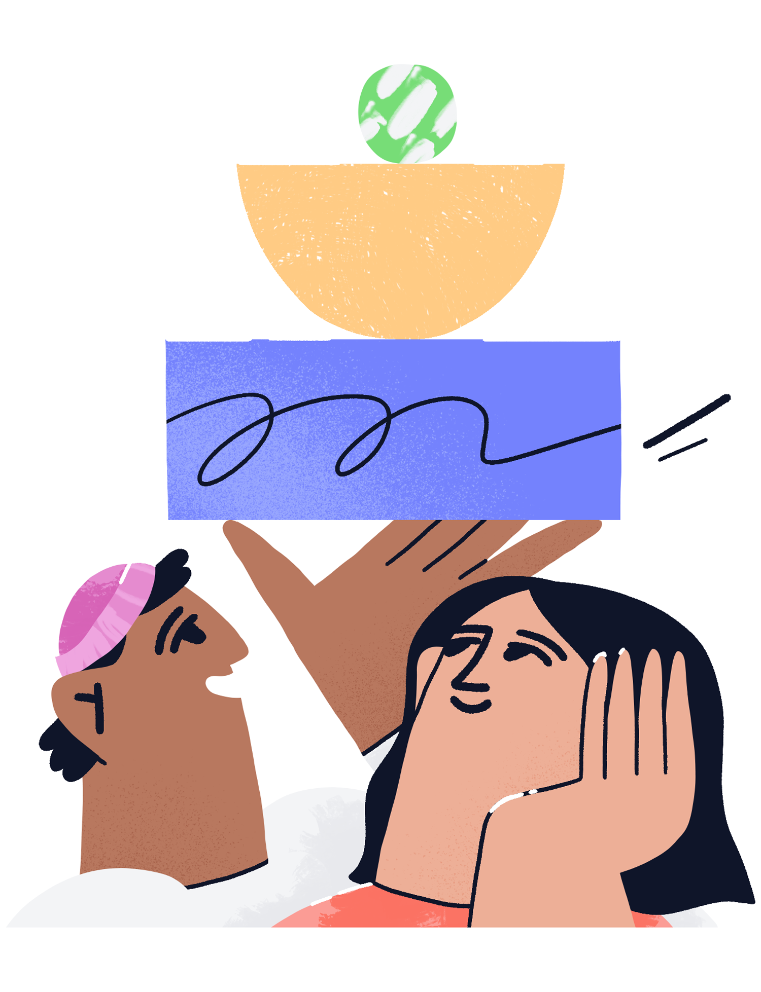
Or like this one. To show relation between historical heritage and progressive technological modernity.
Returning to the context in which the illustrations were used.
Here are some of my favourite images and a description of the context in which they were used.

Validation with selfie video
Eco-frіendly physical products

The ability to receive payment from abroad

Customer support in the language of your choice
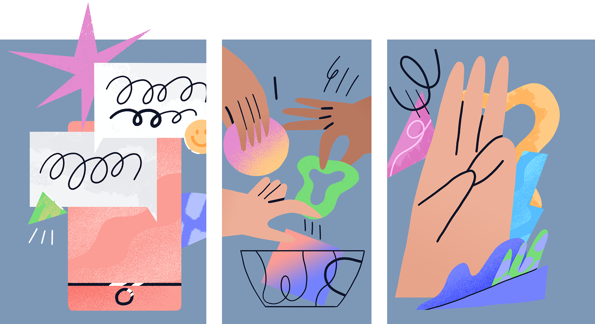
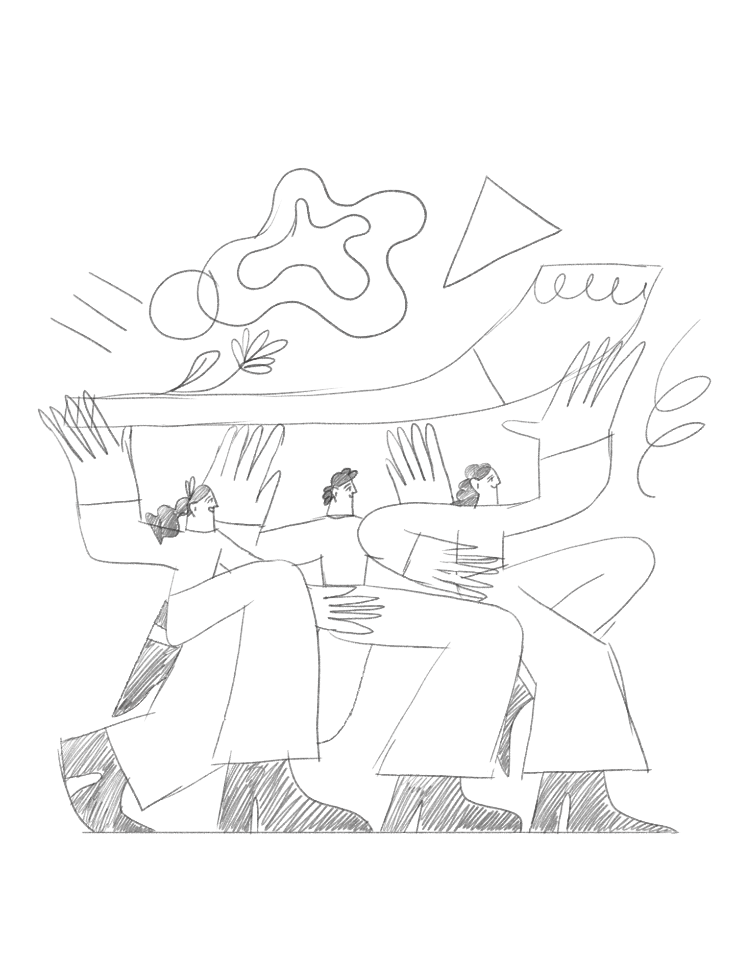
1 - The chat in the app to discuss group spendings or money transfers
2 - The ability to have an account as a group, for general planning costs
3 - Three point about naming

How the invitation and reward program works, described in several steps

About insurance that provides bank, this picture for rental car insurance

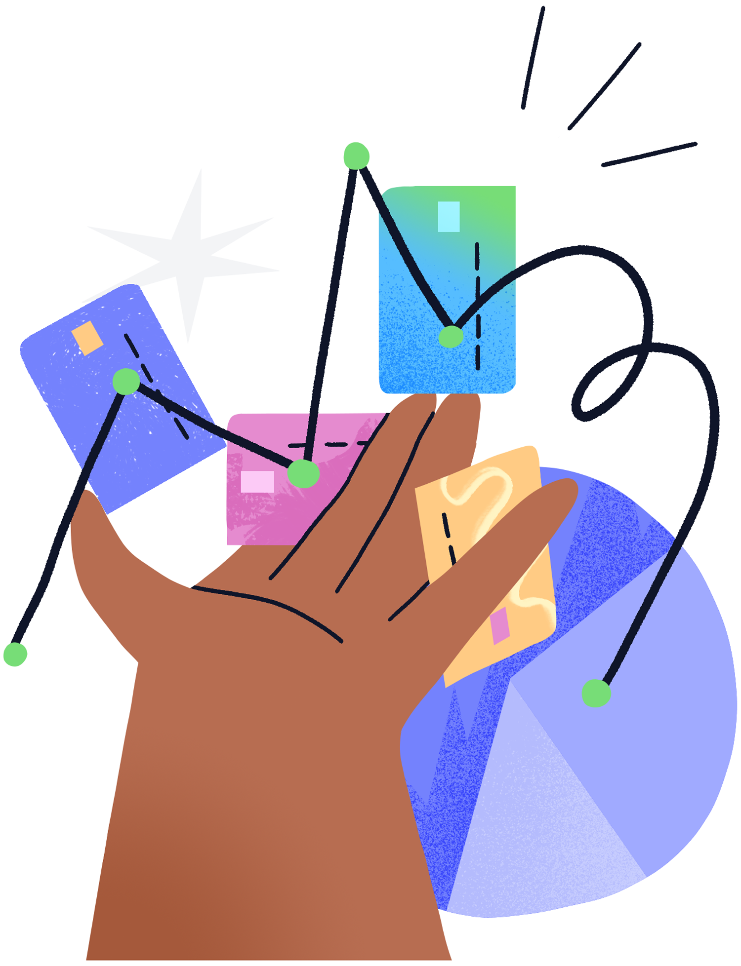
Analytics of the spending
Easily tracking all your banking accounts, spending, incoming, limits etc.

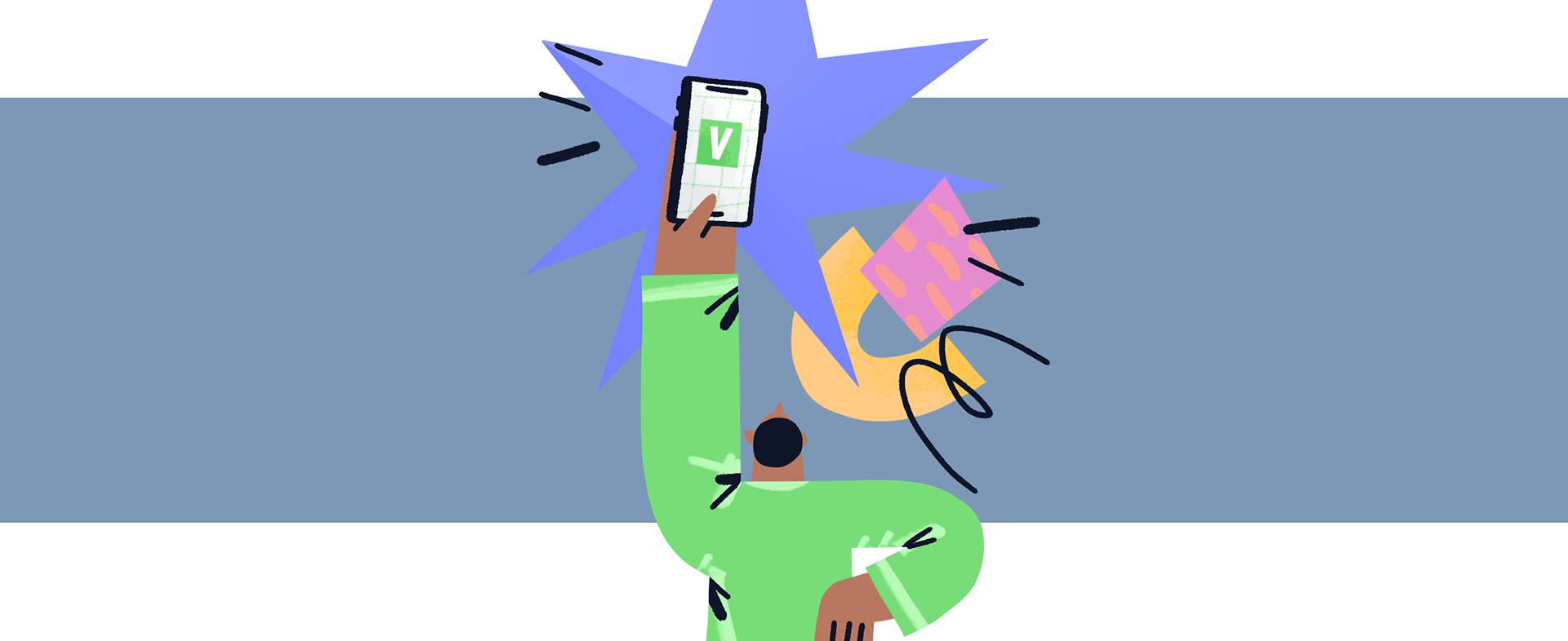
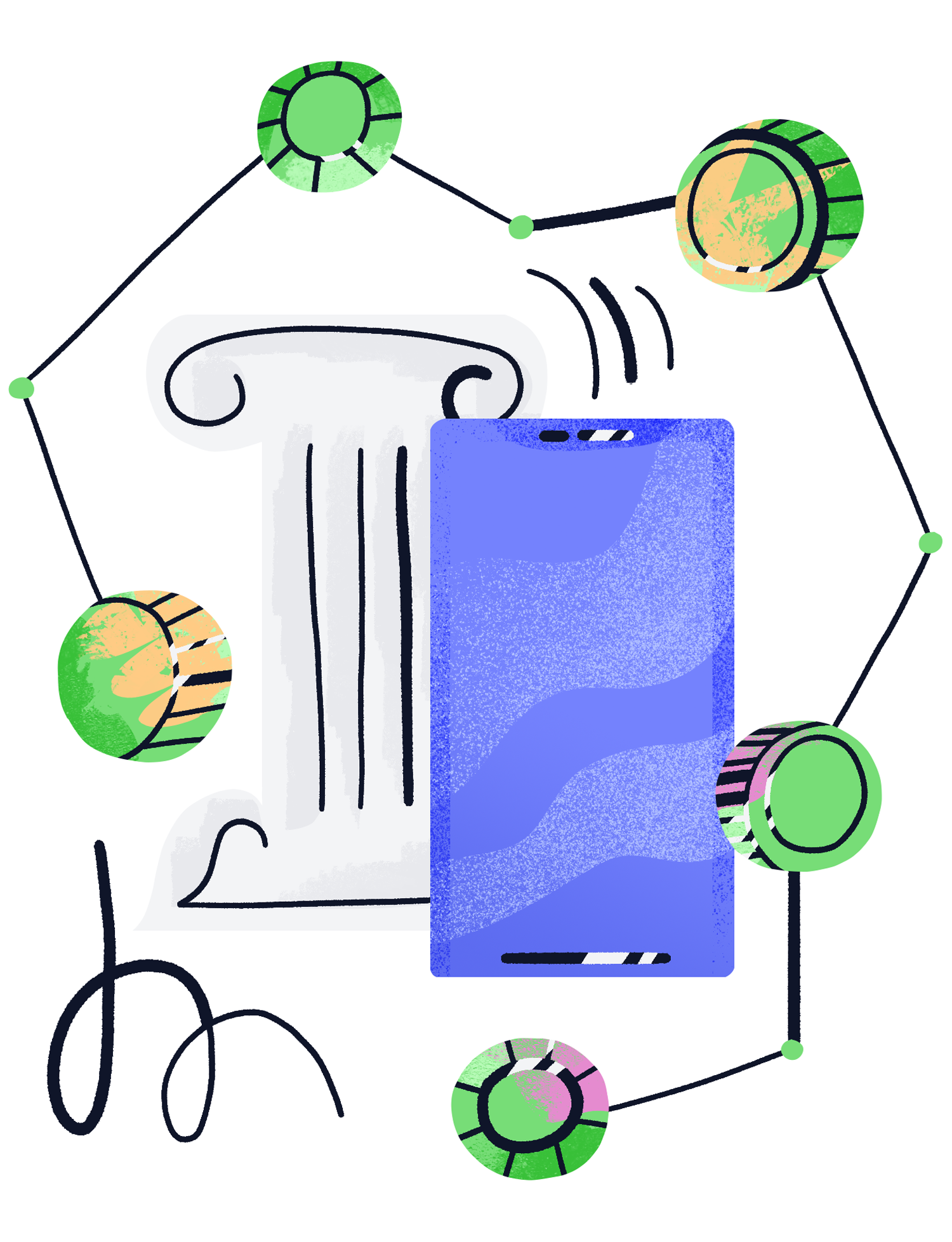
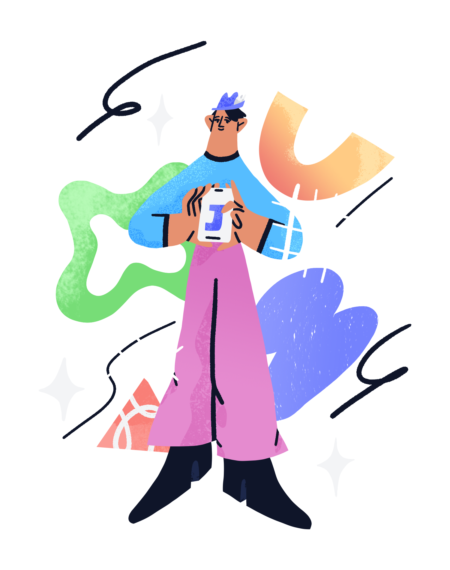
Authentication using only the phone
and

The final step before launching the app
While working on the project, I was part of the design team, and my task was to create illustrations that would help users understand the functionality of the app and add mood and emotions to the user experience.
I hope that my illustrations will help users better understand and appreciate the benefits of the application.


