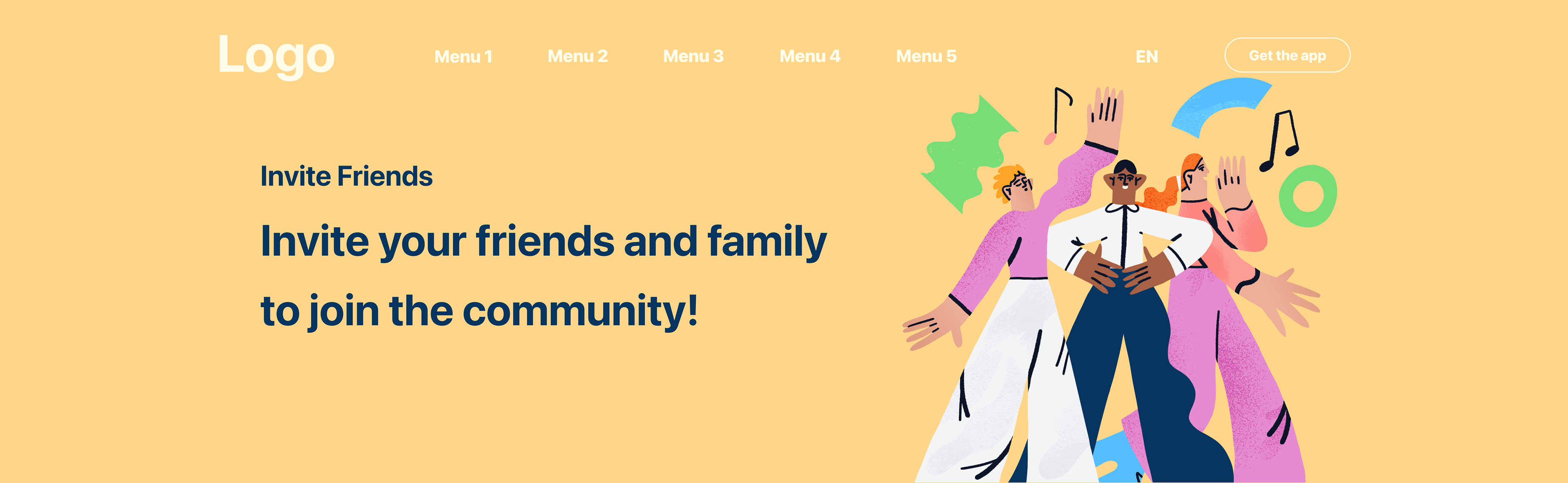
The project was for mobile banking and involved the creation of 60+ illustrations. The illustrations were developed for various services with the aim of simplifying and facilitating communication between the customer and the bank.
Each illustration was carefully designed from scratch, from initial concepts to mockups and prototypes of the application, along with final illustrations and many variations that were relevant for additional tasks.
Each illustration was carefully designed from scratch, from initial concepts to mockups and prototypes of the application, along with final illustrations and many variations that were relevant for additional tasks.
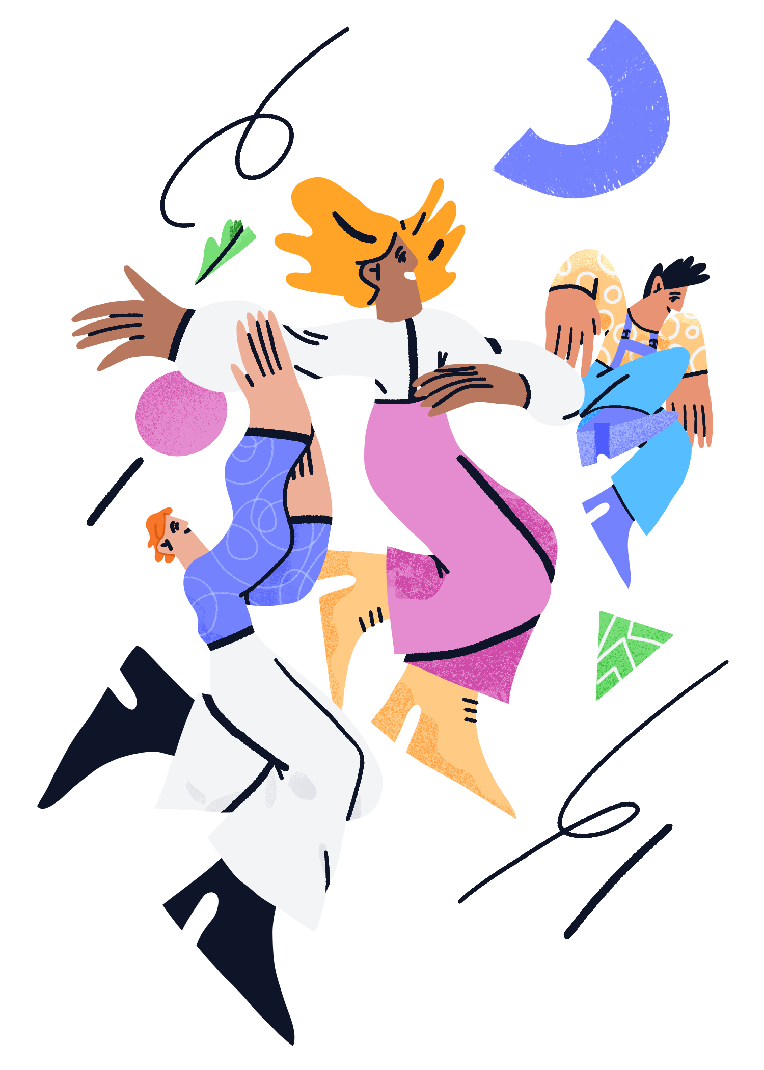

At the beginning of the project, the product stakeholders had a hypothesis that illustrations would help to maintain a friendly tone of voice and improve customer communication.
As a team member, I was tasked with creating the concept of illustrations to fulfill these requirements and worked with the team to validate this solution.
This concept and style were developed based on the following points:
- young generation
- contemporary images
- an individual approach to images to add value and personality to the product, inspire confidence in the
- client, and not seem like a one-day financial product
- color schemes were determined by the existing UI concept of the app
- textures to separate off the background
- styling and simplification for faster reading of images
- abstract elements to add dynamics to simplified images
Design and Elements
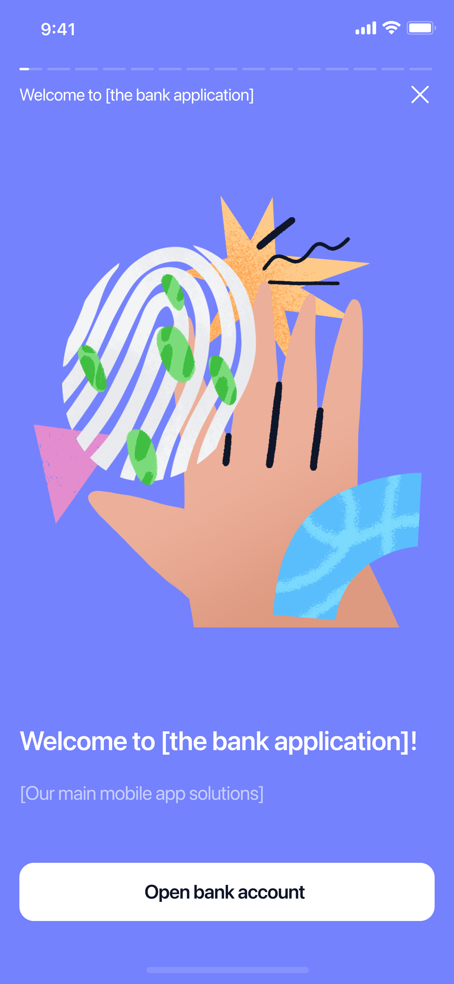
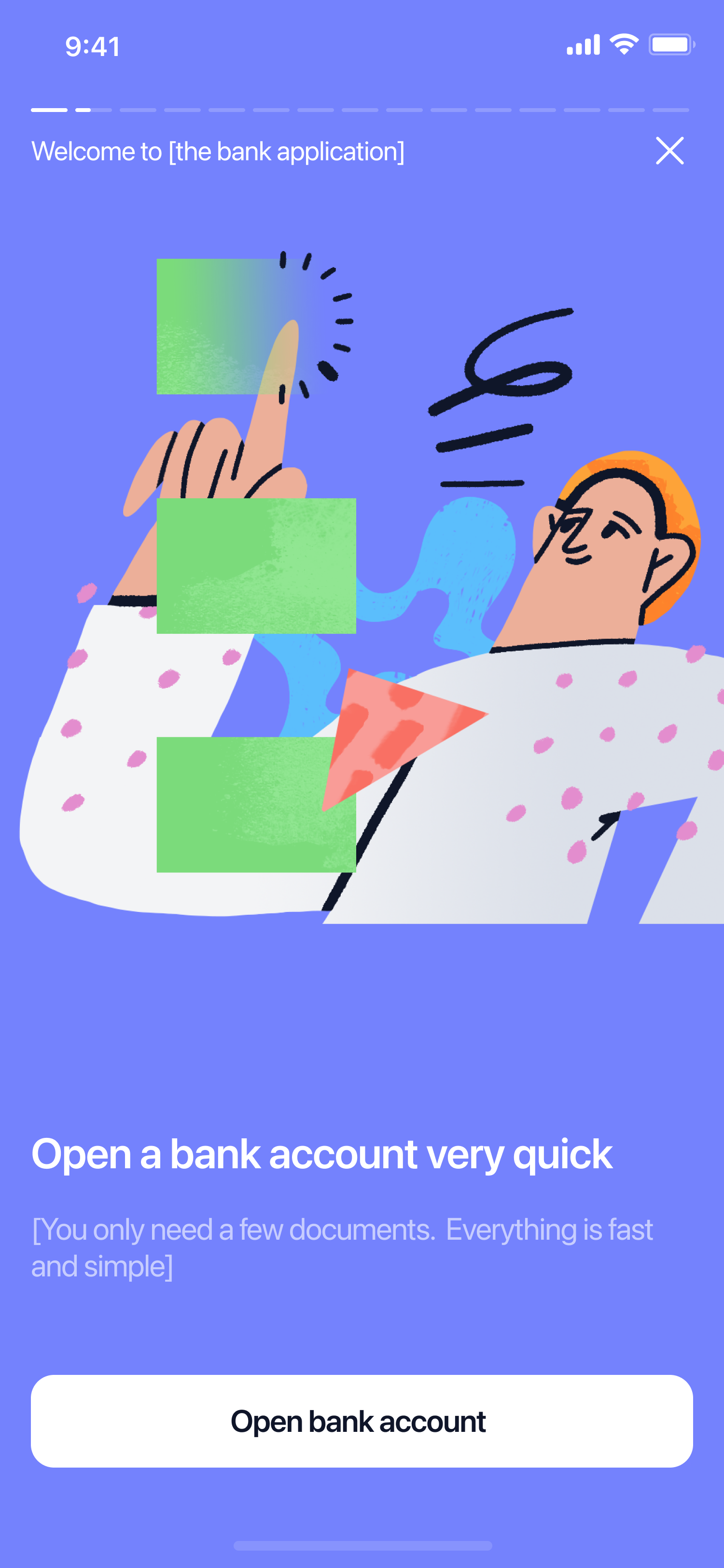
Since the banking application originally had a lot of functionality, and there were plans to add new tools and features, we paid a lot of attention to the onboarding process.

Open a bank account in under few minutes
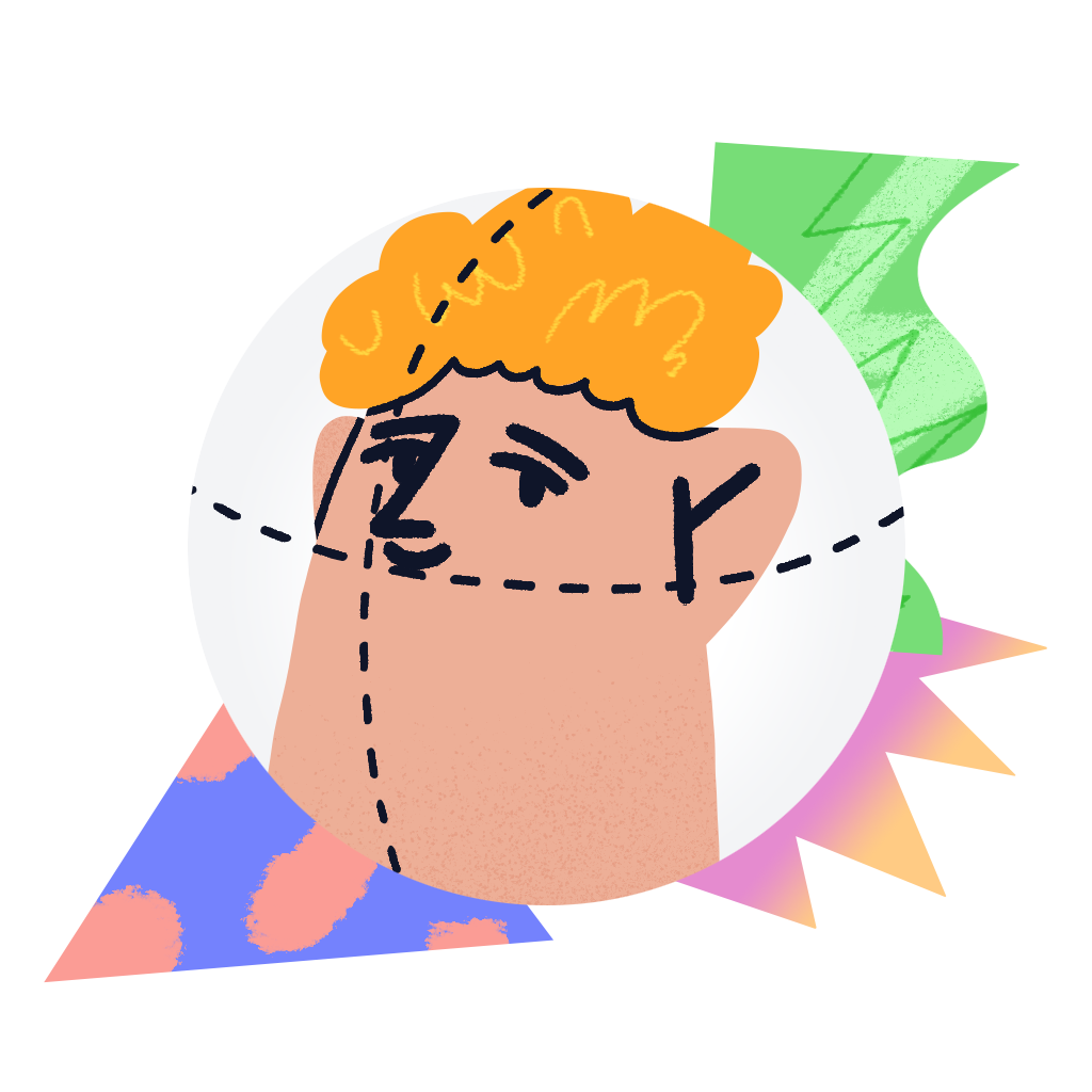
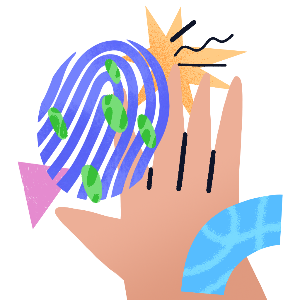
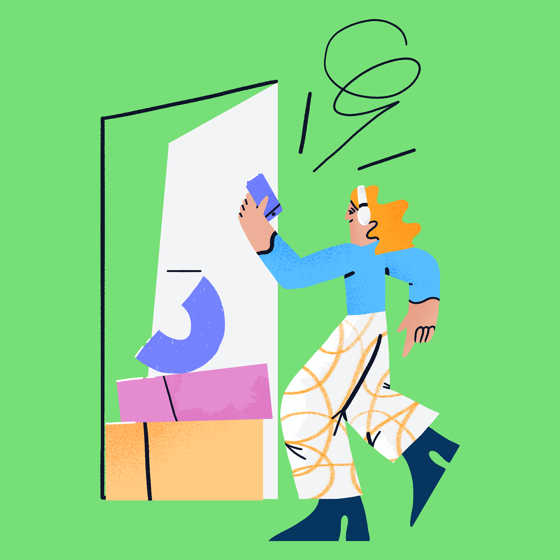
The main characteristics of the objects are their clean and easily understandable shapes.
At the same time, the images were not supposed to be boring and monotonous. Therefore, it was necessary to add details and abstractions to the background.

Shared accounts are about to splitting bills, sharing rent or to make for someone a present as a group

Savings accounts for organizing the money
Each image was created for the description of a specific functionality. Various versions of the presentation were discussed with the team and tested for understanding in conjunction with the text by users.
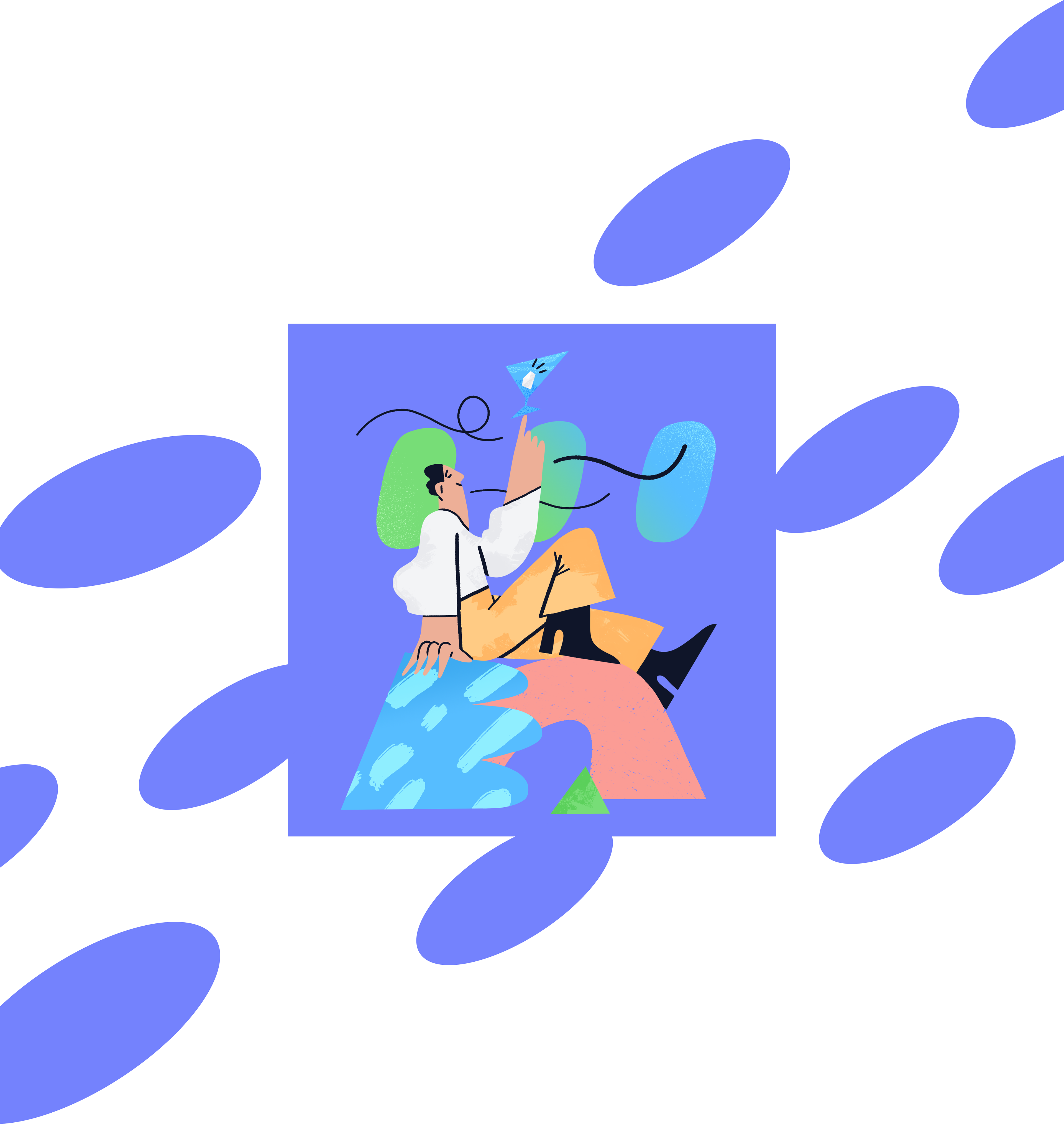

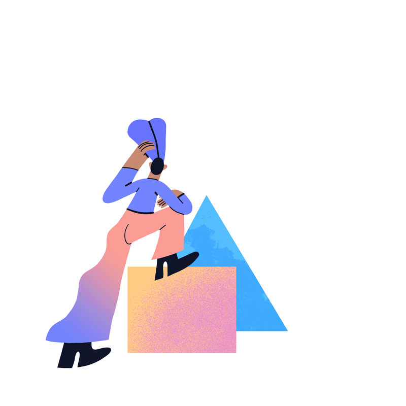
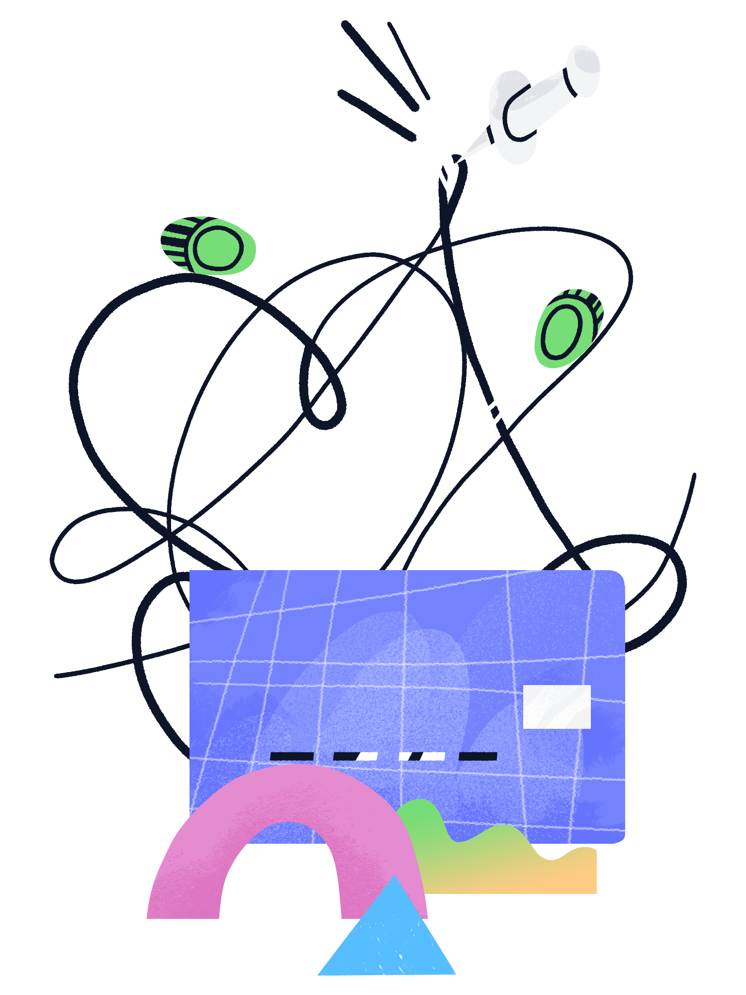
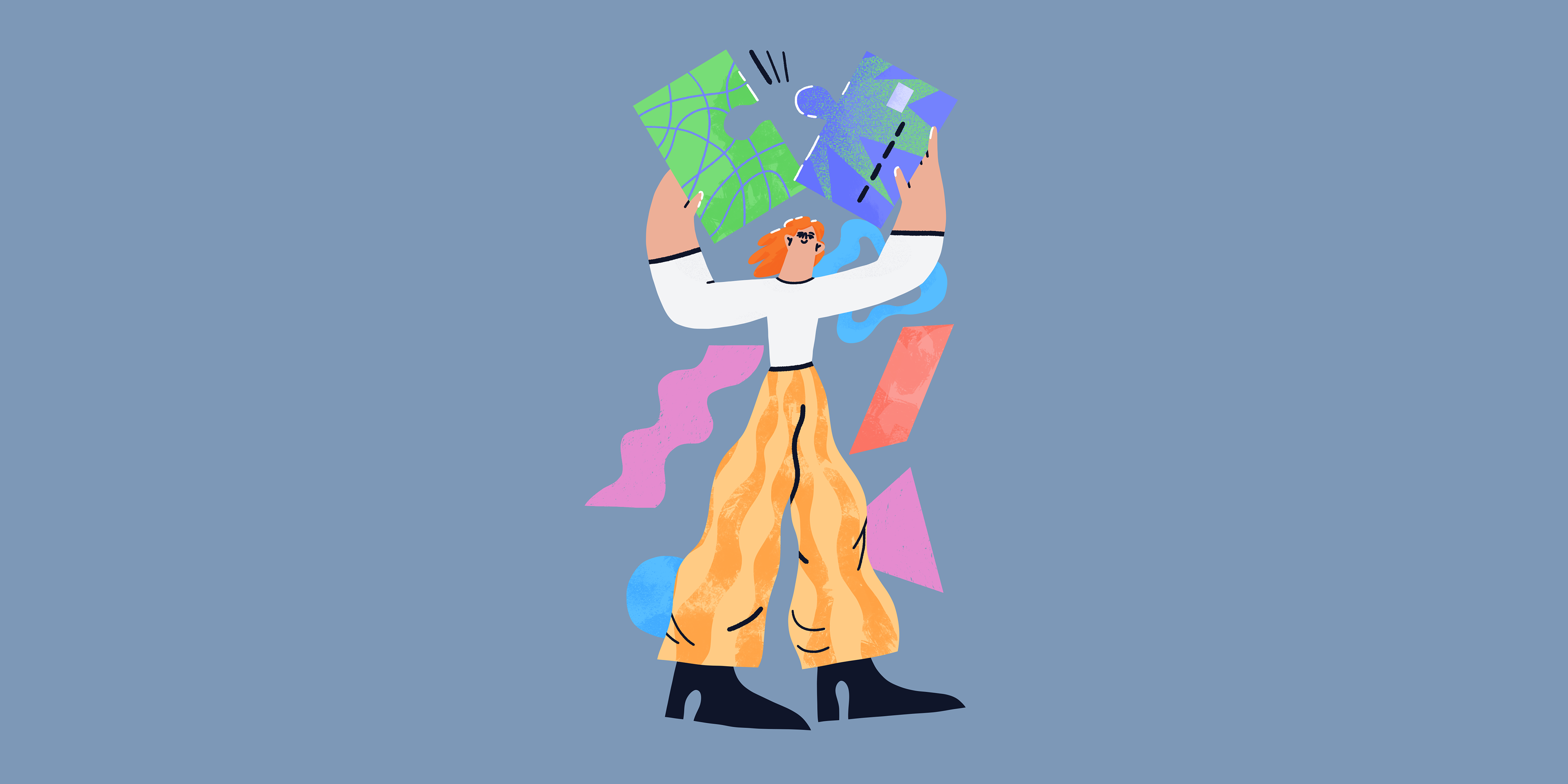
A few words about geometric abstract forms that were part of the style of the most images.
With geometric shapes, we simplified the images, but trying to save the meaning of context.


The colors were set by the UI design team. Sometimes quite active colors were used as a background, and this had to be taken into account while creating images.

Therefore, to separate the picture from the background, I used gradients, textures and patterns.

We used more complex illustrations for text with basic and obvious information where the illustration could not confuse the user.

I added more details and dynamics to such places in order to evoke additional emotions and not let client get bored.
Here I talked about the first developments for the project.
In the next part, I wanted to show how I worked with repetitive or specific details, as well as how I chose the scene for each image.
In the next part, I wanted to show how I worked with repetitive or specific details, as well as how I chose the scene for each image.


